I can sing a rainbow, sing a rainbow, I can sing a rainbow too.
If you’re a child of the nineties (or a parent to one), this song is no doubt ingrained in your childhood memories.
But as a child, I never would have imagined that the colours of the rainbow would be so integral to my future career (otherwise I may have paid more attention to the song instead of using my six-year-old sass to roll my eyes).
While colour psychology sounds like a term made up by hippies to bring paisley back into fashion (blegh!), it is a bigger deal than Kim K’s tush.
I hate to make you feel violated, but… marketers have been using colours to manipulate your buying behaviours for years.
*gasp*
A number of studies have been done on the effect varying colours have on our perceptions of brands and products.
This advice has then been translated into a handy-dandy, sacred notebook of spells and other wizardry of colours that has been passed down generations of business owners.
Lucky for you, I took it upon myself to kidnap the elf sent to guard the sacred notebook and I’m providing you with the goods.
Roses are... Red?
Roses are red, Maccas is too, is it any wonder it makes you want food?
Red is often used by companies to encourage appetite.
While I can’t be certain on specific reasoning (okay, I have no idea on specific reasoning), I have a hunch it has something to do with our primal urges to hunt (red = blood). MmMmm!
Still hungry?
Many fast food chains, McDonald’s and KFC for example, use red for this reason.
Like a bull to a matador, the colour red also creates a sense of urgency, which is why there is often a sea of red come EOFYS time (EB Games, I’m looking at you).
It creates a physical reaction in the body, increasing blood pressure and heart rate.
This physical stimulation, then, explains why red in advertisements and logos encourages movement, excitement and passion.
Brands like Coca-cola and Target utilise red in their campaigns to emphasise fun and high energy.
“Heck yes you want to be sipping a nice, cold Coke while wearing your Target branded khakis on a jet ski because we are FUN”.

Yellow and Orange...The primal urges
Like Little Miss Sunshine, oranges and yellows increase cheerfulness and optimism.
This trickery of optimism is why oranges and yellows are sometimes used in shop fronts and window displays because it lures in impulsive shoppers.
In our modern world where we’re all about instant gratification, impulse buying is becoming a phenomenon and this false sense of optimism promises a “happy ever after” from our products.
However, if you’ve ever stepped foot in the impossible maze that is IKEA you’d know this optimism is only temporary once you get the furniture home and are forced to construct it.
Yellows are also responsible for triggering the logic centres of the brain (which again seems like a wonderful oxymoron when you think of Ikea because nothing about any purchase I’ve made from IKEA has been logical – “why, yes! I do need a stuffed carrot toy!”).
Green as a cucumber
It’s no surprise that green is often used to signify nature and promote environmental issues (trees are part of the environment, trees are green, green = environment!! Mind blown).
We are bombarded with the delicious green apple logo that Woolworths has made famous whenever we turn the telly on, Woolworths’ ploy to trick us into thinking their apples come from the soil and don’t magically come in those plastic wrappings. Ha!
Despite the resemblance to snot, the use of greens help create a sense of tranquility and encourage a balance between body and emotions.
The use of greens pretty much creates a lush yoga retreat for your customers.
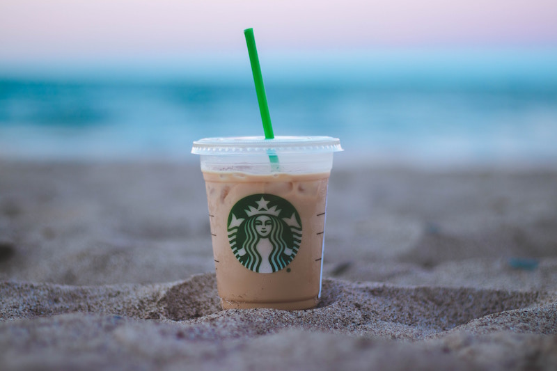
Greens are also used on brands that are associated with health and wealth, like Starbucks and Land Rover, respectively.
Wait.. What do you mean my pumpkin spice latte with three sugars isn’t healthy?
A real man loves blue
Just like tipping water over a burning fire, blue supposedly suppresses appetite. If you think of weight loss brands like Weight Watchers and Jenny Craig, blue is everywhere.
They’re manipulating my desire to eat the last cookie before I even sign up. Those sneaky marketers.
Besides making you skinny, the use of blues also symbolises peace and security, supposedly increasing the trust you form with a brand.
Why do you trust Dell for your laptop or Oral B for your toothpaste? It’s not because they’re the leading brands in their respective categories. It’s because they’re blue.
As our societal norms tell us, the colour blue is preferred by men (which is also ironic considering blue is often associated with maturity… Go figure!).
Purple Haze
Purple is used to signify royalty and gives the impression of being upper class. It’s pretty much the snobby, popular girl of the colour world.
And as if using purple wasn’t enough, Hallmark also decided to add a crown in their logo to really drive home this point.
Purple is said to stimulate the problem solving area of the brain and spark creativity! Which is the excuse I tell myself whenever I sit down to write my articles with a block of purple Cadbury chocolatey goodness.
For this reason, brands that like to get funky and creative tend to use purple in their branding, such as Wonka chocolate.
Have you noticed my addiction to chocolate yet?
50 Shades of... Grey, Black, White
These colours are perhaps the sensible adults of the party.
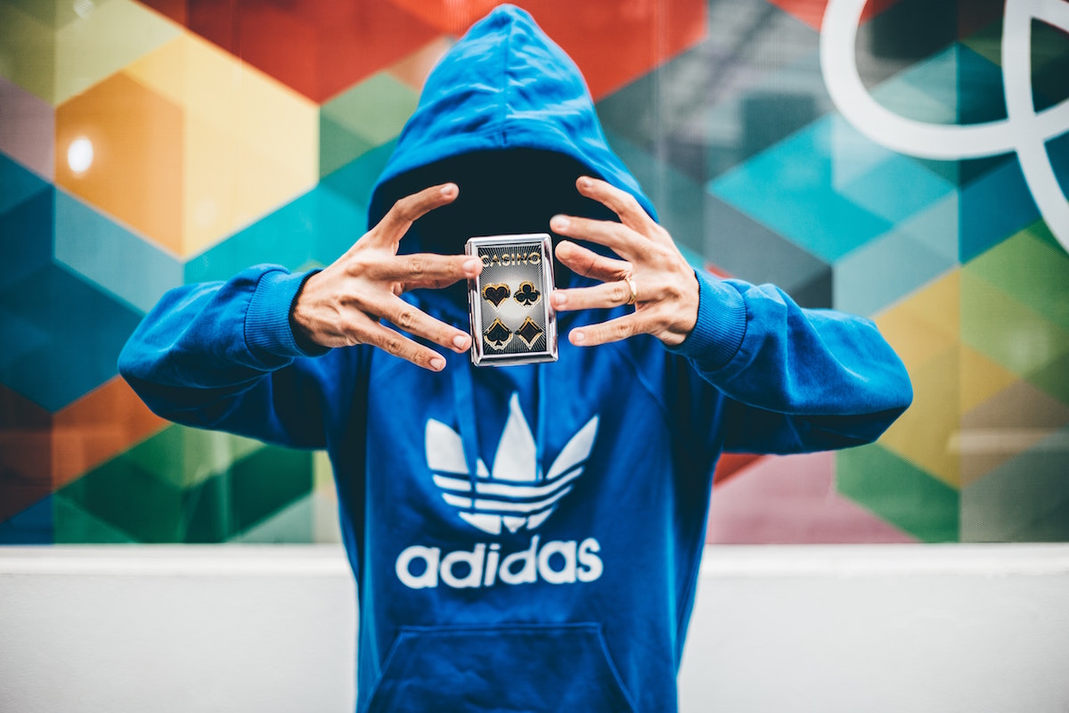
Black is authoritative and, when paired with its monotone friends, can be very powerful. A subtle combination of the three can represent neutrality and practicality.
Brands like Nike and Apple use this classic combination to represent balance (which is exactly what you need when you’re wearing your Nikes so you don’t drop the latest iPhone).
All the colours of the marketing rainbow
Colours can help consumers make snap judgements about your brand and its context.
Let’s consider changing the colours of some famous brands. Imagine McDonald’s signs plastered everywhere in green – an insult to vegetarians and environmental activists everywhere, really.
Or how about Hallmark making their debut in red?
“We’re really excited to be producing that sympathy card after your friend’s grandmother passed away!” … ouch.
While the impact a certain colour has is subjective, its overall purpose should remain consistent with the context.
This consistency will allow newbies to still have somewhat of an understanding of what the heck you’re going on about.
If you’re still a little confused about how colours affect the marketing of your brand, contact CLIQ Marketing Content agency and we’ll make learning colours so much fun you’ll feel like you’re five again!